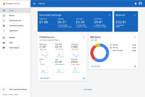
Google Adsense has released its new user interfaces in October 2016. When I opened my Adsense Dashboard, I saw a message to switch to the new Adsense Dashboard, which you can see here.

This message contains a blue button named TAKE A LOOK, which you can use to access the new Google Dashboard interface. Those who want to stay on the old interface, they can click on NOT NOW.
I have selected the new Adsense Dashboard, which is more user-friendly than ever before and easy to use. My advice is that you should use it only. The new dashboard is more inexpensive than the old interface. After years of hard work the Adsense Material Design has been prepared.
Features of the new AdSense Dashboard :
1. New Look and Feel:
The new AdSense Dashboard has changed completely. Using the material design, the home page and menu have been completely changed. There are still more new features to add to it.
2. New Homepage
All the necessary information has been tried in the right place. Using the new interactive cards stream, the complete home page is redesigned. Now you can pin your favorite streams and keep the home page according to your own.
3. Streamlined Menu
In this the top menu has been turned to the left. The new menu has open and hyde function. So when you do not need a side menu, you can turn it off.
Expert Advice
The new interface is not too difficult, you just have to use it and in two four you will be addicted to it. After this you will not feel overwhelmed.
Old Adsense Dashboard
If any of you wants to switch back to an old Adsense Publisher interface, there is an option for that too. To do this you have to click on the Back to Previous AdSense link at the bottom left.

This update is big, but there is no need to talk more about it. It talks about everything in itself, as you use it, you will know about it yourself.

This message contains a blue button named TAKE A LOOK, which you can use to access the new Google Dashboard interface. Those who want to stay on the old interface, they can click on NOT NOW.
I have selected the new Adsense Dashboard, which is more user-friendly than ever before and easy to use. My advice is that you should use it only. The new dashboard is more inexpensive than the old interface. After years of hard work the Adsense Material Design has been prepared.
Features of the new AdSense Dashboard :
1. New Look and Feel:
The new AdSense Dashboard has changed completely. Using the material design, the home page and menu have been completely changed. There are still more new features to add to it.
2. New Homepage
All the necessary information has been tried in the right place. Using the new interactive cards stream, the complete home page is redesigned. Now you can pin your favorite streams and keep the home page according to your own.
3. Streamlined Menu
In this the top menu has been turned to the left. The new menu has open and hyde function. So when you do not need a side menu, you can turn it off.
Expert Advice
The new interface is not too difficult, you just have to use it and in two four you will be addicted to it. After this you will not feel overwhelmed.
Old Adsense Dashboard
If any of you wants to switch back to an old Adsense Publisher interface, there is an option for that too. To do this you have to click on the Back to Previous AdSense link at the bottom left.

This update is big, but there is no need to talk more about it. It talks about everything in itself, as you use it, you will know about it yourself.


![How to contact with Hansraj raghuwanshi [ Himachali Singer ]](https://blogger.googleusercontent.com/img/b/R29vZ2xl/AVvXsEhOv7bx4TnGEx6f5JE5xYaC6FmVGiw-kxyVPVaZD-1wptJSD4yFJj3pqo_2iuFfUcgxIvmY_xjXwrzKxDEtNZDSBtfMB1pZn6WIniE0N_LZtjpZ4V2-WdKrloS2OEGlmLjvpR-K8nyhkQo/s72-c/PicsArt_05-30-12.08.37.jpg)


No comments:
Write Comments